Tuesday, March 29, 2022

Artist Interview: Justin Miller, The Knotty Carver LLC

Hands down, my favorite thing about art is the variety. Everyone has their own individual taste in art, and no two artists’ work is alike, even those that work with the same mediums and subject matter! So let’s learn about each other and share our artwork with each other as often as we can. 😊

My first Artist Interview blog post features the work of the Knotty Carver, Justin Miller!

Justin Miller, The Knotty Carver, is using a chainsaw to cut large pieces off of a fallen down tree.
All photos in this blog post were provided by Justin Miller.

Miller is a wood worker from Canby, Minnesota. In his words, “I usually like to do one of a kind and/or custom designed furniture to fit the customers’ needs.” Since the main component of his art is wood, the pieces are quite literally one-of-a-kind originals! He can fill in the gaps and holes with resin, sometimes tinted, with items embedded, or clear like glass.

An image of a wood table, with a light blue glitter filled resin gap running down the middle.
It's too beautiful to even make a joke here!

“I feel my work is unique,” says Miller. “Done with care so it can be a wonderful conversation starter for years to come.” He’s currently working on a custom end table that is made of a slab of wood from a pine tree that had been twisted by a tornado. As if that wasn’t enough, Miller will be adding two more shelves to it for a laptop and other miscellaneous items. His plan for the top is to pour resin on each side with the wood slab in the middle. The resin will be colored with chameleon mica powder (that’s what gives it the swirly, metallic shimmer), in plum and gold color. But tables aren’t the only thing Miller creates. Below is a clock he made out of black walnut wood with a tiger orange resin.

A round clock face with no numbers, made from a piece of black walnut wood and tiger orange resin.
What time is it? Hopefully naptime.

I asked Miller what his favorite tool for making art was. “Honestly it would be my sawmill,” Miller said. “I like the surprise of cutting a slab and seeing what the tree can provide in its aged lines along with the burl-like looks from the stress the branches have endured over the years.”

His favorite piece he’s made so far, and one of his most popular, is a chess table made out of pinecones. “I really love how the pinecones just pop out in the ever-so-clear resin, when you look at it on the sides you get a 3D look that kinda teases your eyes.”

A handmade chess table made from clear resin and pine cones.
It’s clear to see 😉 why this is a favorite, it’s absolutely stunning!

A detailed shot of the side of the handmade chess table, made from pine cones.

Miller is self- taught, combining his lessons and training from a number of different trades, people, mentors, and family, into what he calls “a great recipe I’ve applied to my artwork.” His advice for artists just beginning their journey? “Don't give up! Keep creating, keep going, don't be afraid to be different! Get yourself out there!” He says he learned from his failures, while knowing it’s alright to fail. “You NEVER fail by trying.”

His next project is building another framed mirror with a design he created on his CNC (computer numerical control) router program, with glow in the dark resin poured into the fixtures, topped off with a layer of resin to really draw out the wood grain.

A mirror framed in wood, with glow in the dark resin accents in the shape of a moon, cats, and stars. This is a-meow-zing!

I also asked Miller what an issue is that he’s encountered with his artwork, since every artist has their own stumbling blocks to overcome. “The COLD! Resin Casting has to be poured in a warm environment for it to cure properly,” he said. “Also being new to the business, it is slow progressing. Getting my artwork out there into this world is proving to be hard. (But I will prevail!)”

To see Miller’s new work or to get in contact with him about your very own beautiful commission, you can find the Knotty Carver on Facebook at Facebook.com/JustinTheKnottyCarver.


Tuesday, March 15, 2022

Travel and the Art After

I’ve done a fair share of traveling in my day. Many of the details of our family vacations growing up are lost to me now, but I remember some things: when we lived in Utah, I remember going to Disneyland (I think we went to Universal once too), to the Arches National Park, and to a cave in a mountain (you had to hike up the mountain, then descend through the cave back to the bottom.) I’ve even been to England a few times. The older I’m getting, the more these trips are having an impact on me, and increasingly, my artwork after returning home!

For example, we took a family trip to New York City in 2018. With three kids. Ages 13, 10, and 9 months. Surprisingly, the baby was the easiest one (no complaining about walking!) When she was tired, she would fall asleep where she was: in a carrier strapped to my chest in the subway, in Times Square in her stroller pushed by her older brother, or safely cradled in daddy’s arms. The boys, on the other hand, complained about the walking Every. Single. Day. Until we got home, and since then it has gone down as a contender for “Best Vacation Ever!”

For me, the city was inspiring. Three years later and I am still painting cities! Times Square’s advertising was overwhelming, but I’m still glad I briefly experienced it once in my life. Here’s the painting I made after we got home from New York, titled “Everyone we met in New York City was Nice Except that One Guy”:

An abstracted painting of a city, with a large black snake-like flying monster in the middle of three buildings.
He's not attacking, he's giving the building a hug.

That was the only one I added a monster to, now that I think about it. Actually, I have a cityscape on my easel right now, and it would really benefit from a monster or two. *Note to self, add monster(s) to new painting.*

The title of that painting is actually referencing a story from our trip when my oldest stepson got trapped by the aggressive dressed up characters in Times Square (in particularly a Minnie Mouse, who would not physically release his arm until I demanded that she “Let my son go!”)

Another trip I was artistically inspired by was our trip to Nevada a few months later, this time without my stepsons. We went to Las Vegas with a baby. With a sick baby. She got a bad cold that lasted the whole trip, so in all of our pictures her cheeks are bright red and she just looks miserable!

We saw many of the sights of Vegas in daytime, visited the Hoover Dam, and explored the Valley of Fire. What fascinated me most was the landscape. The lawns are made of gravel! And while we have flat fields in Iowa as far as the eye can see, some of the desert we drove through is FLAT flat!

Regardless, it was an excellent trip and my husband and I both agree it was a near perfect vacation, even with a sick baby. Here’s the painting/mixed media piece I made for my husband when we returned home, I called it “The Natures of Nevada”:

An abstracted collage painting of some rocks in the desert, next to a tall city building with large signs on it. There is a moon glowing behind gold collaged clouds.
You can't tell, but the signs and moon glow in the dark.

The colors in the Valley of Fire were so unique, and I wanted to have it juxtaposed against the city with so much unnatural lighting. I made the background a dark green, which in hindsight seems a bit cruel as there is so little green in the landscape there.

Our next vacation is already in the works, and we are returning to Florida! Half of our vacation will be in the panhandle, visiting my grandparents. The second half of the vacation will be spent at Universal, where we plan to return to the Wizarding World in full, six-nerd-family-member-Hogwarts-robed glory! I expect there will be some art inspired by this trip – if nothing else, we will have some epically nerdy photos to bring home with us.

…Did I mention that we are driving instead of flying? Prayers are welcome.


Tuesday, March 1, 2022

Mural Design Celebrating Immigration

February 28th was the deadline for submissions for a mural here in my hometown of Denison, IA. Being a military kid, and moving multiple times a year in my twenties, it’s a bizarre thing to call someplace my “hometown”. But we have lived here for five years now, and have no intention of moving, so I guess it’s official. Denison is home.

Back to the mural! The Denison chapter of the League of United Latin American Citizens (LULAC) and Denison Parks & Rec opened up the mural design contest back in December 2021. The mural will be on the back of the band shell building in Washington Park here in Denison. Washington Park is a great space, where in the warmer months the Farmer’s Market is held and sometimes there is live music (last year my daughters got their first taste of blow-up bounce houses there – and they will NEVER be the same!) The playground there is huge, with all sorts of nooks and crannies to play hide-and-seek in, swings, so many slides, and is basically a parkour dreamland. All of my kids love it, except the teenager, and I’ve already forgiven him for that.
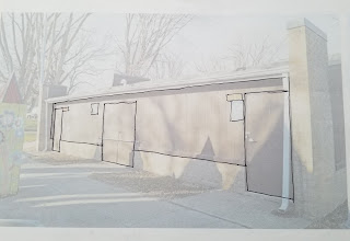
A lightened photograph of the side of a building, with black lines drawn on it to define the edges for a mural. Let's do this!
I had an initial idea of a tessellation, in the style of Escher. Something that started on the left as a butterfly and morphed into a lion on the right. Golds and purples across the wall, how cool would that be?!
Unfortunately, it didn’t meet the contest requirements. There weren’t many, but the mural design should have no more than 5 colors, include the phrase “Immigration is beautiful,” the Denison LULAC name/logo, and finally a pair of monarch butterfly wings (human-sized) ready for photo-ops. Plus, it has to be simple enough for volunteers to paint it.

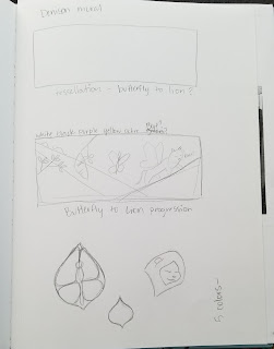
So I scribbled an idea out. It ended up being the second to last page in a sketchbook I had had for over ten years. It was an emotional experience saying goodbye, especially since just a month or so prior I had to say goodbye to my 17-year old Wacom tablet (and HELLOOOOOO GAOMAN! *wink, wink*.)

Here’s the sketch page:

A picture of a page in a sketchbook, showing some rough designs for a mural.

And from there I refined the idea somewhat:
I was still stuck on the lion, as the Denison school mascots are the Monarchs (lions, not butterflies). I also wanted the wings to be at an angle, and on a lion (because a lion with butterfly wings is AWESOME,) and thought that if you stood just right it would look like the wings were yours, and you were next to a lion, and that lion could very well be your best friend for that one amazing photograph! (Disclaimer, don’t try to make friends with lions. They are wild creatures.)

Reign it in, girl (pun intended.) That’s a cool idea, but would it really work when it’s on the wall? When creating artwork for a specific client, exhibition, or contest, you need to keep the audience in mind. Am I creating this design for me, or am I creating this design for them? Are the judges of the LULAC Mural contest looking for a lion BFF? Probably not.

I was also stuck a little bit on the brick at the bottom of the wall. I was going to include it in the design (aka paint it up!) but I’m part of an anti-modern farmhouse group on Facebook, and there are daily posts there lamenting the painting of beautiful brick. Plus, brick isn’t easy to paint. It was settled, then. The design needed to work WITH the brick.

So when I sat down to actually do the design, digitally, I exchanged my precious lion for a lovely pair of butterfly wings. I also switched the purple to a navy blue (the purple was another reference to the school mascot.) And none of it is on the bricks, but the yellow-ochre and other contrasting colors in the mural complement the tan bricks instead. I really think these changes made the design stronger, and in the end much more coherent.

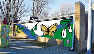
Here's a flat image of my submitted design:

A photoshopped image of a building side, with a mural design on top of it in flat colors. The mural is white, navy blue, green, black, and yellow ochre, and shows different stages of the monarch butterfly life cycle.
Original photo from an article in the Denison Bulletin Review.

I also wanted to include images from different stages of the monarch butterfly life – caterpillar, chrysalis, and adult butterfly – to represent different ages/stages of immigration. My main goal was to keep the design artistic (like a large drawing) but simple enough for the volunteers to recreate, and easily seen from further away as well.

The judges will be looking over submissions in March, and hopefully I will be able to announce in the future that my design won! But even if it doesn’t win, I still wanted to share the design I created and the process behind it.

Original photo from an article in the Denison Bulletin Review.


Update: I wasn't chosen to win (although my design was the runner up!) The winner was a young woman named Isabel Gutierrez! Her mural design shows numerous hands releasing butterflies and it's going to look lovely on the back of the band shell in the park! Congratulations Isabel!