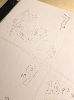
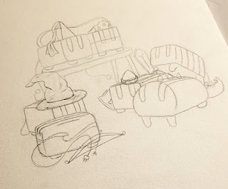
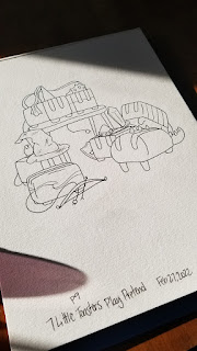
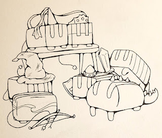
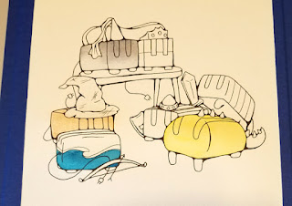
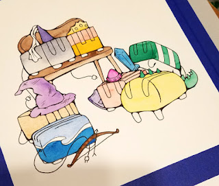
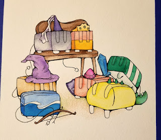
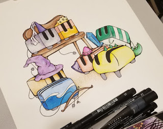
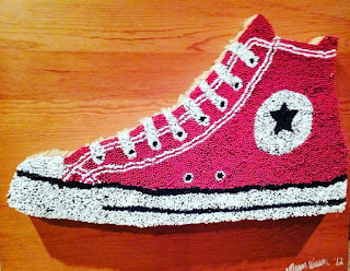
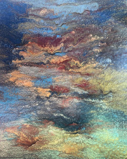
Process Art is artwork where the creative process is more important than the end result. I’m not a process artist, by any means, but I love seeing work-in-progress (WIP) shots of artwork to see how it was made. The camera roll on my phone is full of WIPs; if I had to guess I’d estimate 50% of my photos are of art. Many of these get sent to friends (who are also artists) for their critique.
An entertaining art blog based in rural Iowa and written by author and artist Haley McAndrews, of Red Stone Art Studio.
Tuesday, July 19, 2022
Step-By-Step: 7 Little Toasters
Tuesday, July 12, 2022
Illustration Isn't Real Art
When I was in art school I took a variety of art classes. I
ended up getting my Bachelor’s Degree in Fine Art Photography as at the time I
wanted to make a career out of digitally editing and restoring photographs. Now
I think I would’ve been more suited (despite a great love for photography) to
majoring in drawing. As they say, hindsight is 20/20.
In one class in particular, the professor (who shall remain
nameless) assigned us a handful of written essays in addition to our art projects
throughout the semester. The first essay is one I will remember until the day I
die: she assigned us to write an essay about how illustration isn’t real art.
I was completely floored, and spoke to the Dean of the Art Department. “Illustration is what I do!” I exclaimed, frustrated beyond belief. Looking back, I’m not sure what I was hoping to accomplish with the meeting. I wasn’t looking for her to be reprimanded or anything, but couldn’t I at least write about something else? His response was to say “I don’t want you to feel like I’m just siding with my professors, but…” He sided with his professor. He theorized that she was trying to get me to “expand my horizons.” By stifling an entire genre of art? That doesn’t seem right.
But I have always been a good student, and not a fan of
confrontation, so I wrote an essay defending illustration. The original
essay has been lost for many years, but it went a little something like this:
Merriam-Webster
defines the word illustration as “something that serves to illustrate, such as:
1. A picture or diagram that helps make something clear or attractive. B. An
example or instance that helps make something clear.” I believe we can all
agree that for many years (since 1828, according to their website)
Merriam-Webster has been a trusted dictionary for accurate definitions of words
in the English language.
(When I got my graded paper back, the professor had written some
comments in the margin – the one for this paragraph just said “No.”)
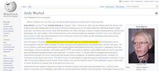
Andy Warhol, prior to his widespread fame and success, worked as an illustrator for Sears catalogue. I don’t think anyone would dare argue that Andy Warhol’s drawings and paintings aren’t art, or that he isn’t considered a “real” artist.
(The professor made a note here that said “always an artist,
not always making art.”)
And finally, according to the definition given above, the majority
of art history can be labeled as “illustrations.” Ancient cave paintings were
created to help tell and record stories. Before photography, portraits were
painted to make it clear who the important people were in society. Even stained
glass windows, sculptures, and paintings in churches were created solely to
illustrate stories from the Bible, so the masses could understand without reading
the book themselves. A perfect example is the Sistine Chapel. Nobody in their
right mind would claim that the Sistine Chapel
ceiling isn’t art, but it sure falls under the definition of “illustration.”
(She didn’t have a comment for this one.)
In the end, I got the lowest grade possible on my paper: a check
minus. Her grading scale apparently has three checkmark levels; a check, which
I guess was like a C; a check plus, which was an excellent grade; and a check
minus, which was on par with an F. She asked me if I wanted to talk about my
paper face-to-face after she graded it, and I said no (again, fear of
confrontation.)
Although thinking back, this wasn’t the first time I wrote a paper like this. Back in high school, we had to write a paper about Beowulf, and mine was a persuasive essay on how Grendel’s mother was just a mom grieving the murder of her son, and Beowulf was actually the villain in the story. My English teacher gave me an A on that one. 😉
Tuesday, July 5, 2022
Artist Interview: Megan Wassom, Artnique
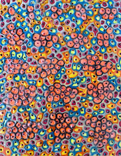
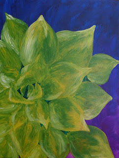
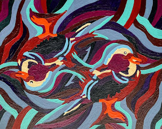
Artist Megan Wassom (based out of Spencer, Mason City, and Davenport, IA) pours an incredible energy into her artwork. Her studio is called “Artnique” and she uses an assortment of mediums to create art with a variety of subjects – ranging from still lifes of plants to landscapes to abstract designs! I can just imagine her smile as she admits, “I would say that I still haven’t quite found my niche. I LOVE encaustics – that’s my favorite. But, I love everything else, too and find it hard to use just one thing. I go back and forth on many media and use as much as I can (or use as much as I know how to use anyway.)”
“When I was fresh out of high school and just starting out
with my art, I entered every competition, sent my (skimpy) resume to everyone,
emailed images of my artwork to every art gallery – I tried really hard to get ‘accepted’
somewhere, anywhere. I wanted to sell my artwork so badly or win a
competition,” Wassom said. “But, I faced more rejections than acceptances and
spent a lot of money on application fees. It left me feeling disheartened,
until I had the pleasure of meeting a textile artist who also happened to be an
art professor at a university here in the Midwest. She told me I needed to calm
down.” The professor told Wassom that after 20, 30, even 40 years, she will
have developed her niche and have a stronger understanding of who she is as an
artist. If she continued applying to everything, all the time, she would just
get burned out. “This advice has helped me out so much and given me more time
to focus on my work – instead of on competitions, selling art and entering open
calls for art shows.”
I asked Wassom what art is, to her. She replied, “I want to
start out by saying what art IS NOT – art IS NOT an afterthought. Art is every
bit of a forethought (or it should be anyway).” Wassom continued, saying that
she didn’t want to criticize any artist’s work, but that she is often
frustrated with the contemporary art world. “I feel that too often, something
is created – a piece, a painting, a sculpture, etc. – and then it is given
meaning afterword.” She said she thinks art is created as a response; as an
expression of an idea, and in response to that idea more artists respond by
creating more art. Wassom believes that art propagates itself in this way and
in doing so, propagates humanism. “I think that to try and give meaning to art
AFTERWARD is a disgrace to art itself. That’s not to say that art can’t have
meaning. Some art is created just for the sake of creating. In that case, I
wish then we would just let it be. Don’t try and give it meaning as we are
viewing it and criticizing it. Just let that piece of art stand on its own,
without meaning, knowing the artist created it…. just because they wanted to!” Amen,
sister!
Her favorite piece that she has created is from 2017. She
made it as a response to her grandmother’s diagnosis of Stage III invasive
breast cancer. It depicts a large cancer cell being attacked by smaller white
blood cells. “It represents my grandma’s fight and victorious win against
cancer,” Wassom said. The idea behind it is that if the smallest, most basic
unit of life can fight off cancer we, as larger units of life made up of those
small units, can too. The piece is 36”x36” and she created it with “TONS of
texturizing paste and TONS of enamel paint on wood.” The piece, titled “Go
Cells Go” is featured in the Lilly “Oncology on Canvas” online gallery. “If you
have a personal history with cancer, I encourage you to check this gallery out.
It is so inspiring!”
Her next project is actually a continuation of a series she
started at age 16 – paintings she calls the “Life Series.” It will consist of
80 paintings when she is finished (she is currently working on #52.) Each piece
represents a life lesson that Wassom has learned. She hopes that someday they
will all be put into a book (a collaboration with her sister, who is a writer.)
“Eventually, I would love for all 80 paintings to be hung in a gallery (perhaps
the Met in NYC?)” she said with a wink. “Anyhow, I work on the paintings 3-4
times throughout the year, and so I will be working on another one here soon!”
When Wassom was younger, she wanted to be an art teacher.
But while in community college, she entered a surgical technology program (with
the goal of having a summer job) and fell in love with surgery and medicine.
She completed her Bachelor of Science degree in Biomedicine at Buena Vista
University. She was planning on minoring in art, but found that many of the art
classes were taught at the same time as her science classes. Wassom is
currently working on her Master’s Degree in Physician Assistant Studies at St.
Ambrose University in Davenport, IA. She hopes to move back to northwestern
Iowa after graduation in 2023.
It's no surprise that being in Grad School has caused a
stumbling block to her art production. “Often, while I sit in class all day, my
mind drifts off and I find myself wanting SO MUCH to be painting something,”
she said. “However, because I am needing to focus on my studying (or pay
attention in class), I don’t have the time to do it. Because of this, I have a
few Word documents saved on my tablet with paragraphs and descriptions I have
thought of – something I can reflect back on when I’m all out of ideas.” She
also has a folder of hard copy images she has found in magazines or printed off
the computer, along with a pile of books, art magazines, and Sotheby’s catalogs
to help fuel her inspiration when she is itching to make art but unsure of what
to create.
I love asking other artists what their favorite tools for
creating are, because the answers are as unique as each individual. “I have
chosen a few things,” Wassom said. “[A] Tuna can/cat food can is PERFECT for
encaustic paints (that’s what’s currently in the one pictured); the clay tool
is an ESSENTIAL tool I use in all my encaustic paintings; I had to include my
paint palette – I use it for every single one of my oil paintings. It probably
has 100 layers of paint on it at least.” She also included a leftover food
container (she uses this for her paint water) with a piece of a star-shaped
pool noodle that she uses to hold her brushes! “The blue wrap is actually a
cloth-type material that we use to sterilize surgical instruments in. I have a
bunch of them and use them to store brushes, tools, pencils, etc. when I am ‘on
the go’ – put them in the slots, roll it up, store it away!”
“I would just like to say that for anyone – artists or
non-artists – be mindful of what you hang up on your walls.” Wassom said,
referring to big-box store mass-produced art. “Are you inspired by that? Does
seeing that generic decoration every day REALLY make you happy? Consider what
it would mean if you had a thought-provoking colorful painting created by a
real artist that you know hanging there instead. Yes, this is sort of a push to
‘support your local artist,’ but I also think we need to consider what we
surround ourselves with.”
To see more of Wassom’s artwork, check out her website here https://megleesunshine.wixsite.com/website or you can follow her on Facebook and Instagram.
