Showing posts with label art blog. Show all posts

Tuesday, August 30, 2022

30 Drawings in 30 Days! Part 2

Let's jump right back in with the second post about my 30 Drawings in 30 Days challenge! Here is a link to the first post, with days 1-10.

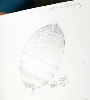
11. Draw something using crosshatching (drawn in pencil) This one was really interesting! I struggled a bit at first with my lines, then found a good rhythm. It doesn't help that I picked the shiny side of a pressed penny as my subject! In the end, I'm quite happy with how it turned out, and would love to use this technique in future drawings!

A photograph of a pencil drawing in a sketchbook. The drawing is of a smashed penny on a chain, shaded with crosshatching.
So shiny!

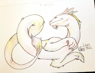
12. Draw a dragon (drawn with pencil, inked with pen, colored with multicolored colored pencil) Now this one was more my style! I had recently discovered a colored pencil with six different colors in one pencil in the depths of my supplies, and thought it would be the perfect way to give this fluffy dragon a magical sort of look!
A pen drawing in a sketchbook. The drawing is of a furry dragon with no wings, two front legs, and linear antlers. It's body swirls around itself, and it is shaded lightly with multiple colors.
I bet he smells like cookies.


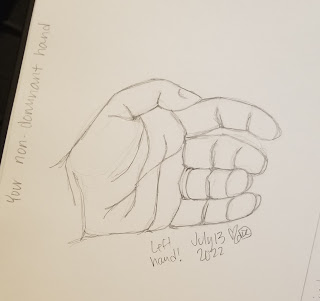
13. Draw your non-dominant hand (drawn with pencil) Pretty sure it's a right of passage to have pages of hands drawn in your sketchbook. Maybe not. But hands are hard, which is why I always say "Practice, practice, practice!"
A photograph of a pencil drawing in a sketchbook. The drawing is of a relaxed left hand, palm to the viewer.
Welp, it's a hand.

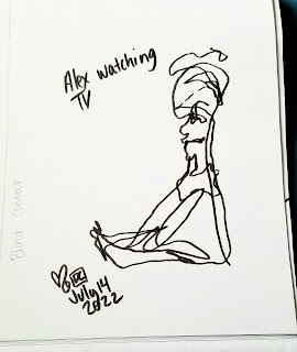
14. A blind-contour drawing (drawn with a brush ink pen) Blind-contour drawing is when you don't pick up your pencil (or whatever you are using to draw with) until you are finished, and you also don't look at your paper, you only look at your subject. I did accidentally lift my pen in this drawing, you can see the broken line where it happened. I picked my daughter, Alex, as the subject for this one. She was watching TV on the couch a few feet away from me, and was a perfect still model! I love the way blind-contour drawings turn out, and should really do more of them.
A photograph of a pen drawing in a sketchbook. The drawing vaguely resembles a scribbled person sitting, with the notation "Alex watching TV".
You can kind of tell it's a person!

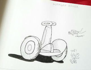
15. A motorized vehicle of some sort (drawn with pencil, inked with pens) I probably should have picked a car, as my car and truck drawing skills are MIA (missing in action - as you can see in the tiny sketch below) but instead I chose a Segway! 
A photograph of a pen and ink drawing in a sketchbook. The drawing is of a white Segway machine.
I've never ridden one, have you?

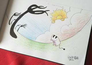
16. A landscape of your choice (drawn with pencil, inked with pen, and colored with colored pencil) Of course a toaster was going to make an appearance at some point in this challenge! 
A photograph of a pen and colored pencil drawing in a sketchbook on red fabric. The drawing is of a fantasy landscape, with black forks for trees, a lion in the clouds for a sun, and a single white toaster jumping in the air.
Be free, little toaster!

17. A drawing with pointillism for coloring/shading (sketched with pencil, drawn with markers) Another toaster?! This wasn't my favorite one so far, but it was interesting. I'd do more pointillism (using "dots" to create an image) in the future, I think.
An image of a marker drawing in a sketchbook. The image consists of multicolored dots, and forms an image of a stylized toaster.
Even the lines are dots!

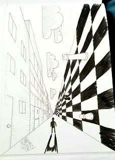
18. A scene with single-point perspective (drawn with pencil, inked with pen) I had started off with this being a cityscape because I loooove cityscapes but after one side of flat, bland buildings I wanted this drawing to get wEiRd!
A photograph of a pen and ink drawing in a sketchbook. The drawing is of a lone figure, with a long strait road in front of them. On the right are large buildings. On the left is a giant chess board on it's side, with huge chess pieces. above the figure are clouds in the sky, but they are sideways instead of upright.
After 20 years, finally some proper surrealism!

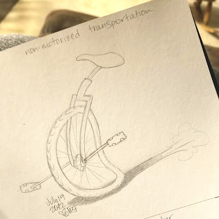
19. A non-motorized mode of transportation (drawn with pencil) The whole point of this challenge was to try techniques/subjects I don't usually use in my art. We have proof that realism isn't my specialty (sorry again, Jessica!) but I do keep trying! For this one though, I wanted something a little more my style. And in the end, I really like how it turned out! 
A photograph of a pencil drawing in a sketchbook. The drawing is of a unicycle, in cartoon style, moving quickly from right to left across the page. It has no rider.
I've never ridden one of these, either!

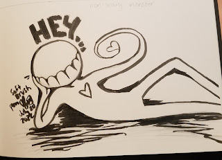
20. A non-scary monster (drawn with a soft brush pen) I had DC, a couple of toasters, a city... it only makes sense that I'd include one of my monsters as well! This time with classic reclining style!
A photograph of a pen drawing in a sketchbook. The drawing is of a stylized monster, with a round head and no facial features except large teeth. The figure is reclining, with the text "HEY..." above it's head. It has a heart on it's chest, and it's hand is forming the shape of a heart.
Oh my.

Well folks, we are two-thirds of the way through the challenge! Again, here is a link to days 1-10, and here is a link to the last set, days 21-30.


Tuesday, August 23, 2022

30 Drawings in 30 Days! Part 1

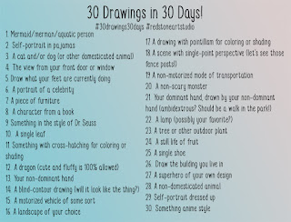
There are hundreds if not thousands of daily drawing prompts you can find online, all laid out nicely for months of creative inspiration and practice. Many of them consist of a single daily word that leaves all sorts of room for interpretation, like “red” or “enlighten.” I thought it would be fun to build a list of my own, and share the results. My goal was to stretch my artistic muscles a bit, so some of the prompts I came up with are very different from what I normally draw! This will be a three-part post, with ten prompts and images included in each post, in the end totaling up to 30. I started this on July 1st, 2022 (but Haley, aren't there 31 days in July? YES! And on the 31st, I took a break!)

A digital image, with a teal and salmon background. It lists 30 drawing prompts, one for each day of a 30 daily drawing challenge.

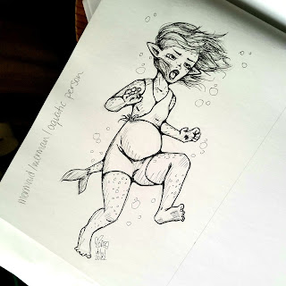
Let’s dive right in (pun intended) with 1. Mermaid/merman/aquatic person (drawn with pencil, inked with pens) This character is called Rema, and she's a water fairy from a fantasy story I've been rolling around in my head for a while. In this drawing, she's pregnant and about to birth her egg!

A photograph of a pen and ink drawing in a sketchbook. The drawing is of a pregnant water fairy, she is surprised.
Bloop, bloop!

2. Self-portrait in pajamas (drawn with pencils and gel pens) I'll admit, the first thing I reach for in the morning is my robe! I've probably mentioned this before, but every time I draw a self-portrait, I represent myself as this demon-cat-princess named DemoniCat (DC for short.) It's also how I sign all my artwork (prints get signed with my full name.)

A photograph of a gel pen drawing in a sketchbook. It is of a female demon-cat wearing a robe and looking sleepy.
Anyone else rock the robe life?

3. A cat/dog/domesticated animal (drawn with pencil) This is our Jack Russell terrier, Lola. She didn't sit still long enough for me to finish, but it's a pretty good likeness!

A photograph of an unfinished pencil drawing in a sketchbook. The drawing is of a Jack Russel terrier laying down.
She's a good pupper.

4. The view from your front door or window (drawn with pencil) Across from our house are some fields and a little wooded area where we regularly see wildlife - I don't usually draw landscapes, so this one was fun to do!

A photograph of a pencil drawing in a sketchbook. The drawing is of a scribbled wooded landscape.
No wild toasters, though.

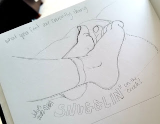
5. Draw what your feet are currently doing (drawn with pencil) It's funny, but I didn't really consider what I do with my feet when I'm sitting - turns out I tuck my legs up on the couch, feet together, and cross my legs or ankles when I sit in a chair! 
A photograph of a pencil drawing in a sketchbook. The drawing is of two feet, resting together on a couch. The words under the feet say "Snugglin' on the couch."
That one's lefty, this one is righty.

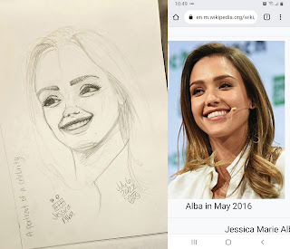
6. A portrait of a celebrity (drawn in pencil) Oh Jessica Alba, I am sorry! 😂 I know if I put in more time, I could continue to adjust her features and eventually get it right, I just didn't want to put in that much time. This is why I don't draw realistic portraits!

An image of a drawing on the left, with a screenshot on the right. The left is a picture of a pencil drawing in a sketchbook: it is a poorly proportioned portrait of Jessica Alba. The image on the right is the reference photograph of celebrity Jessica Alba.
It's okay to laugh, that's what I'm doing!

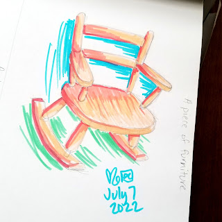
7. A piece of furniture (drawn with pencil, colored with markers) This is a tiny wooden rocking chair for my girls that used to be mine when I was their age!
A photograph of a marker drawing in a sketchbook. The drawing is brightly colored and quickly sketched, and is of a child sized rocking chair.
Heirloom status achieved!

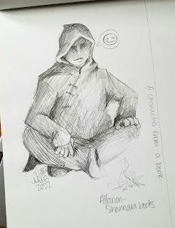
8. A character from a book (drawn in pencil) I'm currently reading the Sword of Shannara trilogy, and this is how I picture the druid Allanon in my head.
A photograph of a pencil sketch in a sketchbook. The drawing is a hooded and cloaked figure sitting cross-legged in front of a small fire. The figure's face is shaded and his mouth is smirking slightly.
What does a campfire really look like?

9. Something in the style of Dr. Seuss (drawn in pencil, inked with pen, colored with crayons) I thought using my kids' crayons would be an appropriate medium for this one. This is a self-portrait of me, just finishing up a painting in my studio, when a mouse skittered past my bare feet (we found out it was a mouse when we caught it two days later, at the time it sounded like the size of a small dog!)
A photograph of a pen and crayon drawing in a sketchbook. The drawing is of a female demon-cat, wearing a multicolored dress and holding a phone. Something has run past her feet and scared her. It is drawn in the style of Dr. Seuss.
Nailed it!

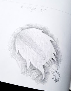
10. A single leaf (drawn with pencil) I'm not sure if one segment of a Christmas cactus qualifies as a 'leaf' but it's what I chose! If I was to choose again, I think I'd pick a dried leaf from a tree, I think those just have more character.
A photograph of a pencil drawing in a sketchbook. The drawing is of a single segment of a Christmas cactus plant.
Pointy, yet soft!

There you have it, the first round of daily drawings! Here's a link to the second set of ten, and here's the post about the final ten.

Tuesday, July 12, 2022

Illustration Isn't Real Art

When I was in art school I took a variety of art classes. I ended up getting my Bachelor’s Degree in Fine Art Photography as at the time I wanted to make a career out of digitally editing and restoring photographs. Now I think I would’ve been more suited (despite a great love for photography) to majoring in drawing. As they say, hindsight is 20/20.

In one class in particular, the professor (who shall remain nameless) assigned us a handful of written essays in addition to our art projects throughout the semester. The first essay is one I will remember until the day I die: she assigned us to write an essay about how illustration isn’t real art.
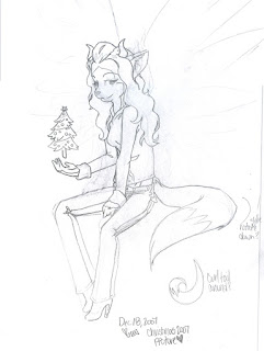
A Christmas themed self-portrait illustration by Haley McAndrews.
A glimpse into my sketchbook, circa 2007.

I was completely floored, and spoke to the Dean of the Art Department. “Illustration is what I do!” I exclaimed, frustrated beyond belief. Looking back, I’m not sure what I was hoping to accomplish with the meeting. I wasn’t looking for her to be reprimanded or anything, but couldn’t I at least write about something else? His response was to say “I don’t want you to feel like I’m just siding with my professors, but…” He sided with his professor. He theorized that she was trying to get me to “expand my horizons.” By stifling an entire genre of art? That doesn’t seem right.

But I have always been a good student, and not a fan of confrontation, so I wrote an essay defending illustration. The original essay has been lost for many years, but it went a little something like this:

Merriam-Webster defines the word illustration as “something that serves to illustrate, such as: 1. A picture or diagram that helps make something clear or attractive. B. An example or instance that helps make something clear.” I believe we can all agree that for many years (since 1828, according to their website) Merriam-Webster has been a trusted dictionary for accurate definitions of words in the English language.

(When I got my graded paper back, the professor had written some comments in the margin – the one for this paragraph just said “No.”)
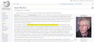
A screenshot of the Wikipedia page about Andy Warhol, taken on April 19, 2022.
If it's on the internet, it must be true.

Andy Warhol, prior to his widespread fame and success, worked as an illustrator for Sears catalogue. I don’t think anyone would dare argue that Andy Warhol’s drawings and paintings aren’t art, or that he isn’t considered a “real” artist.

(The professor made a note here that said “always an artist, not always making art.”)

And finally, according to the definition given above, the majority of art history can be labeled as “illustrations.” Ancient cave paintings were created to help tell and record stories. Before photography, portraits were painted to make it clear who the important people were in society. Even stained glass windows, sculptures, and paintings in churches were created solely to illustrate stories from the Bible, so the masses could understand without reading the book themselves. A perfect example is the Sistine Chapel. Nobody in their right mind would claim that the Sistine Chapel ceiling isn’t art, but it sure falls under the definition of “illustration.”

(She didn’t have a comment for this one.)

In the end, I got the lowest grade possible on my paper: a check minus. Her grading scale apparently has three checkmark levels; a check, which I guess was like a C; a check plus, which was an excellent grade; and a check minus, which was on par with an F. She asked me if I wanted to talk about my paper face-to-face after she graded it, and I said no (again, fear of confrontation.)

Although thinking back, this wasn’t the first time I wrote a paper like this. Back in high school, we had to write a paper about Beowulf, and mine was a persuasive essay on how Grendel’s mother was just a mom grieving the murder of her son, and Beowulf was actually the villain in the story. My English teacher gave me an A on that one. 😉
Monday, June 20, 2022

Overlooked Artistry at Universal Studios

Art is everywhere. I’ve said it for years, and I’ll say it again. Art is everywhere.

But maybe it would be more accurate to say “Artists touch everything.” Well… no, that’s not right either. “You can find the touch of an artist everywhere you look.” That’s more like it! Now we don’t sound like creeps.

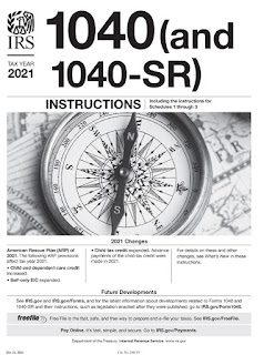
The front cover of the 2021 IRS Form 1040 Instructions. Cue the horror music!

Exhibit A: The cover for the official instructions on how to file your Form-1040, aka your TAX RETURN (if you live in the US.) Isn’t it beautiful? An artist took that photograph. A graphic designer created the IRS logo. And the FreeFile logo. Another designer laid out the rest of the page, with a font that was specifically chosen. The list goes on. That piece of paper from the Internal Revenue Service that has the power to keep people awake at night, is a thing of beauty. And what exposure it gets! The majority of adults in the United States are required to file a Form-1040 every year! The artists involved must be SOOOO famous (whoever they are!)

But, Haley, I thought we were talking about Universal! It even says it in the title! Right you are, friend.

For Spring Break this year we spent four days at Universal Studios: going on all sorts of rides, casting spells at the Wizarding World, and just enjoying the warmth of summertime… but in March (an unusual thing for Iowans.) Emma’s favorite ride was E.T., Alex could have spent the whole vacation playing at the toddler park in the Curious George area, and my stepsons went on the Hulk rollercoaster about 8 times, I think. My absolute favorite part of Universal, however, is the atmosphere.

A photo from the E.T. ride at Universal Studios Florida. The E.T. ride gets pretty weird.

I could spend my days just staring at the false buildings and storefronts, lost in the tiny details that make Universal Studios an experience, instead of just a bunch of rides. From area to area, and even ride to ride, the uniforms are different for the personnel. There’s even different music playing around you, that relates to which area of the park you are in. I remember my stepsons getting tired of me pointing it all out a few years ago on our first vacation there: “Look! An artist painted that!” “An artist made this wall look so old!” “Look, this is fake rust on this sign, hand painted by an artist!” “YES, HALEY, WE KNOW!”

But do you? I have a hard time fathoming the extensive team it took to design and implement all of it. Here’s a great example, the door going into the SpongeBob SquarePants shop:

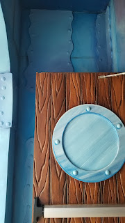
A picture of the corner of the door to the Spongebob shop at Universal Studios Florida. I'm ready! I'm ready!

The 3-dimensional building is painted to look like it belongs in a 2-dimensional cartoon, under the sea. The artists working on it (I can’t imagine it was just one person) used varying shades and tints of each color to accent and help define the edges of the faux paneling on the wall, and the “grain” of the “wooden” door. The décor inside is all related to the kids’ TV show – there’s even a framed “Employee of the Month” picture of SpongeBob on the wall.

Where can I get red shingles like that?

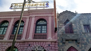
Another excellent example from a kids’ TV show: Curious George! This area of Universal is a waterpark, where they have “books” laid out with pages open to read, letting kids feel like they are running around inside the story! The technique here is genius – painting the buildings flat but vivid colors, with bright trim, lots of signs, and black paint along the edges and details, making it look more 2-dimensional and cartoony, outlined just like the illustrations in the Curious George books!

Some building fronts at Universal Studios Florida.

The artists spent hours and hours of painting by hand to make the bricks look exactly right. Check out the ornate details on these railings and windows, and the sign made of lightbulbs – it’s all custom designed and created for these specific buildings – many of which are false fronts! Thank you, artists!

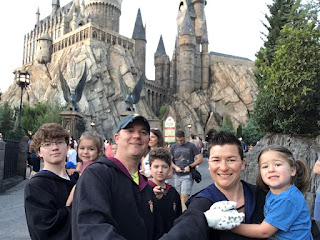
And because it was the McAndrews clan, of course we spent a lot of time in the Wizarding World. Replicating Diagon Alley must have been a massive endeavor – and they nailed it! As you enter through the “magic” brick wall, you hear the sound of the bricks shifting and clacking, and then you are hit with the unmistakable music from the movies. You really feel like you’ve entered a magical place, particularly with so many people dressing in Hogwarts robes and waving their magical wands around!

The McAndrews family in front of Hogwarts castle. It's us. We are the robe-wearing wand wavers.

Universal is such a popular destination for people from all over the world, that wait times for the rides are regularly 60-120 minutes or more! It’s brilliant, but they (Universal) have planned out the areas where you wait in line and decorated them so you feel immersed – for the Spider-man ride, you walk through the Daily Bugle office; for the King Kong ride, you weave your way through a jungle temple; and for the Hogwarts ride, you find yourself exploring the Defense Against the Dark Arts classroom. It’s all decorated spectacularly, with hidden Easter eggs for devout fans to pick out.

Walls filled with talking paintings in Hogwarts castle, Universal Studios Florida. I could listen to the paintings argue all day.

It’s such an incredible experience to be there with my kids, and I look forward to going back again when my girls are a little bit older (and able to go on more rides) but not too old to stop believing in the magic there. Emma was so excited about going to “Harry Potter’s castle” before we went this time, and now that we are home likes to talk about how much “Mommy screams on all the rides!”

Tuesday, March 1, 2022

Mural Design Celebrating Immigration

February 28th was the deadline for submissions for a mural here in my hometown of Denison, IA. Being a military kid, and moving multiple times a year in my twenties, it’s a bizarre thing to call someplace my “hometown”. But we have lived here for five years now, and have no intention of moving, so I guess it’s official. Denison is home.

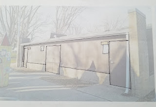
Back to the mural! The Denison chapter of the League of United Latin American Citizens (LULAC) and Denison Parks & Rec opened up the mural design contest back in December 2021. The mural will be on the back of the band shell building in Washington Park here in Denison. Washington Park is a great space, where in the warmer months the Farmer’s Market is held and sometimes there is live music (last year my daughters got their first taste of blow-up bounce houses there – and they will NEVER be the same!) The playground there is huge, with all sorts of nooks and crannies to play hide-and-seek in, swings, so many slides, and is basically a parkour dreamland. All of my kids love it, except the teenager, and I’ve already forgiven him for that.

A lightened photograph of the side of a building, with black lines drawn on it to define the edges for a mural. Let's do this!
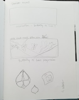
I had an initial idea of a tessellation, in the style of Escher. Something that started on the left as a butterfly and morphed into a lion on the right. Golds and purples across the wall, how cool would that be?!
Unfortunately, it didn’t meet the contest requirements. There weren’t many, but the mural design should have no more than 5 colors, include the phrase “Immigration is beautiful,” the Denison LULAC name/logo, and finally a pair of monarch butterfly wings (human-sized) ready for photo-ops. Plus, it has to be simple enough for volunteers to paint it.

So I scribbled an idea out. It ended up being the second to last page in a sketchbook I had had for over ten years. It was an emotional experience saying goodbye, especially since just a month or so prior I had to say goodbye to my 17-year old Wacom tablet (and HELLOOOOOO GAOMAN! *wink, wink*.)

Here’s the sketch page:

A picture of a page in a sketchbook, showing some rough designs for a mural.

And from there I refined the idea somewhat:
I was still stuck on the lion, as the Denison school mascots are the Monarchs (lions, not butterflies). I also wanted the wings to be at an angle, and on a lion (because a lion with butterfly wings is AWESOME,) and thought that if you stood just right it would look like the wings were yours, and you were next to a lion, and that lion could very well be your best friend for that one amazing photograph! (Disclaimer, don’t try to make friends with lions. They are wild creatures.)

Reign it in, girl (pun intended.) That’s a cool idea, but would it really work when it’s on the wall? When creating artwork for a specific client, exhibition, or contest, you need to keep the audience in mind. Am I creating this design for me, or am I creating this design for them? Are the judges of the LULAC Mural contest looking for a lion BFF? Probably not.

I was also stuck a little bit on the brick at the bottom of the wall. I was going to include it in the design (aka paint it up!) but I’m part of an anti-modern farmhouse group on Facebook, and there are daily posts there lamenting the painting of beautiful brick. Plus, brick isn’t easy to paint. It was settled, then. The design needed to work WITH the brick.

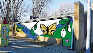
So when I sat down to actually do the design, digitally, I exchanged my precious lion for a lovely pair of butterfly wings. I also switched the purple to a navy blue (the purple was another reference to the school mascot.) And none of it is on the bricks, but the yellow-ochre and other contrasting colors in the mural complement the tan bricks instead. I really think these changes made the design stronger, and in the end much more coherent.

Here's a flat image of my submitted design:

A photoshopped image of a building side, with a mural design on top of it in flat colors. The mural is white, navy blue, green, black, and yellow ochre, and shows different stages of the monarch butterfly life cycle.
Original photo from an article in the Denison Bulletin Review.

I also wanted to include images from different stages of the monarch butterfly life – caterpillar, chrysalis, and adult butterfly – to represent different ages/stages of immigration. My main goal was to keep the design artistic (like a large drawing) but simple enough for the volunteers to recreate, and easily seen from further away as well.

The judges will be looking over submissions in March, and hopefully I will be able to announce in the future that my design won! But even if it doesn’t win, I still wanted to share the design I created and the process behind it.

Original photo from an article in the Denison Bulletin Review.


Update: I wasn't chosen to win (although my design was the runner up!) The winner was a young woman named Isabel Gutierrez! Her mural design shows numerous hands releasing butterflies and it's going to look lovely on the back of the band shell in the park! Congratulations Isabel!